Thursday, July 31, 2008
Fresh beet pasta - Recipe
A couple of months ago Ned had some medical tests and the DR. said that he need to go on a low cholesterols diet. He's health was over all good, but it's better to address this before it get to be a real problem. So, we started making a joined effort to eat more at home. I really enjoy cooking and also, the time and money it saves over going out all the time. Ned has been really good about going to the gym and already lost over 15 pounds!
This is what I made for dinner today, it looked so nice I thought it would be cool to share the recipe, it also tasted really nice!
Ingredients (for 2 people)
2 large beets
1/2 jalapeno pepper (if you don't like spicy, just skip this...)
fresh or dried herbs (I used basil, but this will also work well with thyme or oregano)
2 garlic cloves
1 table spoon of olive oil
juice of half a lemon
half a pack of pasta
about 2 table spoons of cheese (I used muenster, but mozzarella or Parmesan would work well to)
a pinch of sea salt
fresh ground pepper.
Instructions
This is super easy to make and another benefit is that it's better when it's been in the fridge for a while, so I made this while making breakfast and we had it for dinner.
chop the beets to small pieces (or if you are not a big fan of raw beet, grate them with a cheese grater. Chop the pepper and the garlic clove. Mix all those in a tupperware and add the lemon juice, olive oil and herbs. close the lead and leave in the fridge for a few hours or overnight.
When you are hungry, cook the pasta and pour the beet mixture on it, add the cheese, a little bit of salt and pepper and you're done!
You can even make this totally cholesterol free if you replace the cheese with some non fat yogurt. It's yummy!
Wednesday, July 30, 2008
Shoot Today
I'm still sick, it's not as bad, but still, not 100% OK, I'm coughing and I get tired really fast, it sucks! I just need to rest every now and then and I can't work or do as much as I want to and usually able to.
I especially felt it yesterday and today while we were shooting. Usually, I'm really energetic and positive and taking care of a lot of different things, but today it was really hard to both make the model feel comfortable, shoot some snapshots and look at the monitor to make sure Ned's photos are in focus and that everything looks great.
I mainly focused on the model, but I'm still pretty happy with some of the photos I took.
Sunday, July 27, 2008
dead words butterflies
This started as an illustration Friday piece and sort of grew from there. The word of the week was "canned" which I didn't like at all, but it did made me think of those animals and insects that are preserved in formaldehyde, and how, preservation of something, often destroy it, not because the thing itself is gone, but because the meaning and the use of them is gone, and so a beautiful spontaneous and very fragile thing, like a butterfly, or even a spoken word sometime, becomes useless when it's dead in a box or written down in a book.
Labels:
art,
box,
butterflies,
friday,
glass,
illustration,
wood,
words
Tuesday, July 22, 2008
Pubic Panties Featured
I've been sick for a couple of days now, and can't bring myself to do anything but sleep and listen to audio books, any attempt for anything else end with me taking a nap. It sucks to have so many plans and things I want to do and not having the energy to do them.
However, it's really nice when things sort of take care of themselves - the funny pubic panties I made a while ago for the louchelust store were featured in a couple of sites and had over a 1000 views on Etsy! (though they haven't sold yet...)
Saturday, July 19, 2008
Enough - Illustration Friday
A series of 4 drawings I made today for illustration Friday. The word of the week was "enough" it reminded me of a line from a dead Kennedys song that goes like this:
Is my cock big enough
Is my brain small enough
For you to make me a star
Give me a toot,
I'll sell you my soul
Pull my strings and I'll go far
It made me think of how I feel so not good enough so often, how between the beautiful women in the street, a more successful friend and the media, I too often feel not rich enough, not pretty enough, not thin enough, not friendly or nice enough.
The reference for those images are from vintage playboy magazine ads, portraying those images of "just buy this product and you'll get those beautiful successful life you always felt you should have".
Thursday, July 17, 2008
knockout items photography tutorial
There are two questions that keep coming up in the Etsy Forum help section, one is about how to take better pictures and the second is about those 4 tiny items on the etsy header. I was taking photos of an item for the louchelust store today and I though it would be a good opportunity to make a photoshop tutorial for how to take a photo on a totally clear white background, those seem to appear in treasuries more and also, become candidate for "knockout" items.
So here is goes:
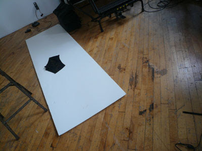
The most important thing is to start off with a good picture, even though there's a lot you can fix in photoshop, it's better and quicker if you start with a clear good shot. I used absolutely no artificial lighting to shoot those panties. I just shot next to the window and had beautiful natural light. To get a white background, I use foam core. It's inexpensive and pretty solid, so you don't get wrinkles or strange shadows like you get when shooting on paper.
I take 6-7 photos of each possession of the item and choose the best one. This is the picture that I started with:
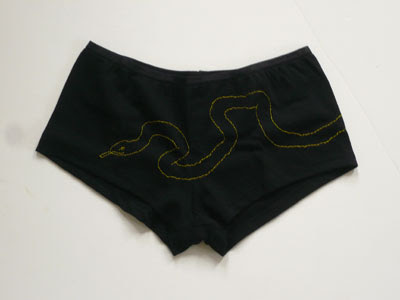
Not so bad - but as you can see, the background is not white and there are some spots that really shouldn't be there.
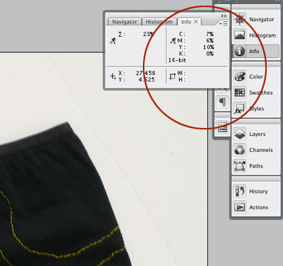
I use the "info" window to check the amount of color there is in the back ground. also the surface looks white, it's actually containing quite a lot of color: 7% cyan, 6% magenta and 10% yellow. in order to achieve clear white, those numbers should be all at 0. as you are working, go back to the info and check those numbers often - also, check in different parts of the image. In this photo for instance the numbers on the left side was higher (which means the background was darker).
So, I started working on it:
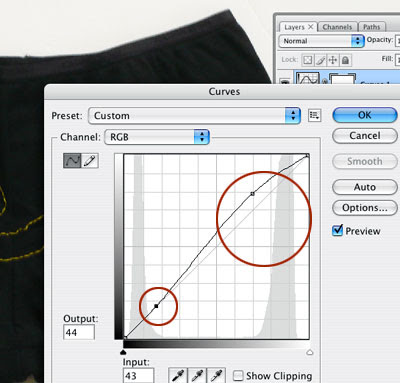
The first thing I did was ad an curve adjustment layer (from the layer>new adjustment layer>curve) when you begin working with this, a window open and a curve appear, I pushed the whites (the higher dot on the curve up to make the whites in the picture whiter. Also, I pushed the dark part of the curve down a bit to maintain the darker colors in the image and make it more contrast. Look at the picture while you do it and be gentle, if you do it too much you'll get a clear background but loose a lot of details in the photo.
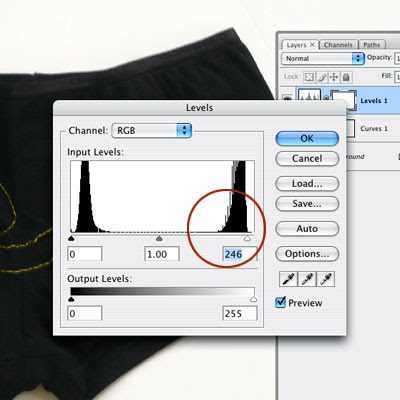
It was getting better but still I had some color in the background. So I added another adjustment layer - this time, using level (layers>new adjustment layer> levels) This leads to a window that looks like a histogram - look at the white side of the scale (on the right) as you can see, there's a small area where there's very little information, before the histogram start - that area is the pure whites. There's a little "noise" in it push the triangle till where the histogram actually start - again, if you do this too much you'll loose details, so be gentle...
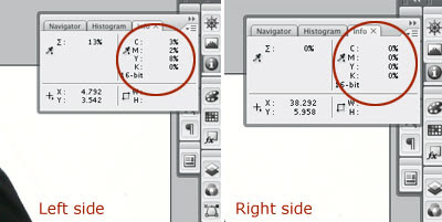
Remember before I started - the right side of the photo was lighter then the left?! so now, if I look at the numbers in the "info" window, I have total white on the right (woohoo!) and still a little bit of color on the left (3% cyan, 2% magenta, 8% yellow) so I still need to do some work. There are a lot of different ways to get rid of it, but this is what I chose to do in this case:
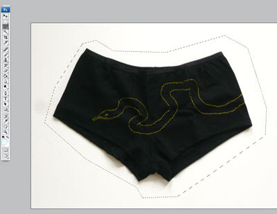
I loosely picked the outline leaving all the shadow of the item inside the selection - it what makes the photo looks real, and I didn't want to lose that.
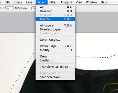
I inversed the selection (Select>inverse) to get only the background area picked and not the item.
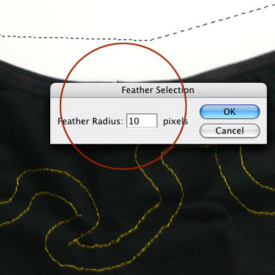
I use the feather option to soften the harsh line of the selection, I chose 10 px, actually I could probably use 20 or 30 and it would work well, and even better but this is how I did it...
I press the delete button to erase the left over color on the background - pay attention to the layer you are on and don't accidentally delete a part of the adjustment layers - it will make the problem worse...
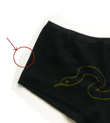
As you can see, there's still a little bit of a harsh line there, even with the feather. So I used a large eraser brush (choose the eraser tool and a large brush (I used the 200px for this). to soften up this line.
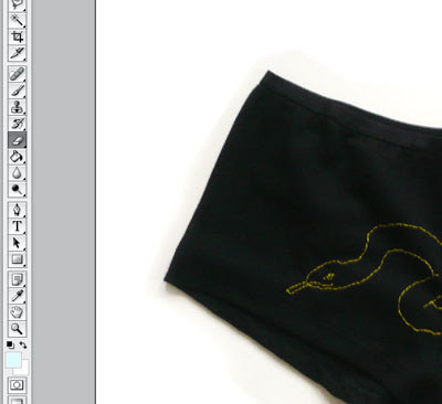
There - much much better!
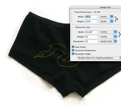
Last thing - resize the image. I always work on largest files possible - it allow more details to be included in the picture, and for me to have more options in working on the small details of it.
The most important thing to remember is subtleties, the first mistake people do in photoshop is to over do it, leading to a too bight, to saturated image that just look unreal and bad. always keep as much of the original photo information there, It would have been easier to just delete all the white to pure while in this case, but then the item would look like it's cut out of it's background. By keeping the original shadow, The item looks natural and good on the white background.
There are about 100 other ways to do this, but this is usually what works for me...
Labels:
background,
better,
etsy,
image,
knockout,
manipulation,
object,
photography,
photoshop,
pictures,
snake,
tutorial,
underwear,
white
Tuesday, July 15, 2008
Making New Things
Sometimes it's really nice to invent new items. It's not that I'm tried from glasses cases and cards, but it's just nice to be challenged with something new and feel what a new material feels in my hands.
I found this awesome vest in the Salvation Army store - my favorite shopping destination ever! it cost, I'm almost embarrassed to say, 3.99, and it's really beautifully made and just feels great. I spend 3 days embroidering it with a lilac elk and a shooting star. It was so much fun to make, even though it took ages...
This heavy wool like fabric is the best embroidery surface I found so far, it was a pleasure to work with.
Also, after our oven was finally fixed, I finally discovered the awesomeness of Phabeo porcelain paints. And used them to make 3 small vases. One was already sold this morning!
Labels:
phabeo,
porcelaine,
salvation army,
shopping,
store,
vase,
vest,
vintage,
wool
Sunday, July 13, 2008
New Painting
I made this drawing for Illustration Friday, the word of the week was "foggy" and though nothing in this illustration has to do with fogginess, it's mostly has to do with my state of mind in the past few days...
I'm really down and depressed over nothing in particular, I feel like I can't think properly. Nothing bad happens, it's just hard to focus or do anything, and every small thing, whether it's an e-mail or some work, feels like a humongous effort.
At the same time, reality proves that I'm making a lot of art and good art at that, but all that doesn't feel real to me right now. I had a really great idea for a shoot and then another great idea for something to do with the pictures, and though those 2 things are happening now and are really exciting, I feel really useless.
This painting is for sale hare
Labels:
art,
bone,
everything,
foggy,
friday,
illustration,
larissa,
painting,
remember,
skeleton
Friday, July 11, 2008
Shoot today
Me and Ned had a bit of a fight last night, he fall asleep and I stayed up and
were sad and upset. I only had about 3 hours of sleep before having to wake up at 9:00 to get ready for the shoot and start. I was really really tired all day and didn't feel like doing anything aside of going back to sleep. At night, I wrote Ned an angry e-mail, that was the only way I could think of to express my feelings and not waking him up so he'll be more or less functional in the shoot. He read it this morning and so, he was sad and upset as well.
We didn't have time to talk till after the shoot was over, by which time we were both really tired and there was not a lot to say anyway.
The upside of being so tired and sad is that I was a lot less concern with being nice and so it was much easier to just flat out tell the hair, make up and stylist what I wanted and get things going my way.
Even with the tiredness and sadness, the photos came out really beautiful.
Saturday, July 5, 2008
Sour
Illustration Friday word of the week was sour, it's really hard to do a drawing of a flavor...
Eventually I remembered a friend I used to go out drinking with in Israel and who always had Whiskey sours. I miss that bar...
Labels:
art,
drawing,
friday,
illustration,
painting,
sour,
watercolor,
Whiskey
Friday, July 4, 2008
Thursday, July 3, 2008
Featured!
I've been taking pictures from when the first cheaper digital cameras started to come out, somewhere 4-5 years ago. My first camera was a Samsung which was a full square and had no screen. However, I always felt like this is just a useful hobby but that my art lays elsewhere. I still think that way, however, Being featured in an online photography magazine really made me feel like there's more to it then just playing around with a camera.
I'm really excited about it.
Check it out!
Tuesday, July 1, 2008
New Store
After I made the books from the set paper Ned used for a shoot a couple of days ago, using Ned's photograph to decorate the covers, we thought it would be really cool if Ned had an Etsy store to connect to his Erotic site, and sell photography prints and other erotic related art in.
So today we set it up together.
It was not easy, we were both stressed and were having a pretty shitty day as it was, but we went for it. Ned manage to get a cut on his hand from the frame glass he was cleaning to take a photo of one of his prints in the frame, and then break it. We were feeling more shitty then before. Eventually he shot it with the frame without the glass and it came out really nice.
The cool thing is that while we were trying to not get cut by glass and freaking out, the new store first sell happened! it was so exciting. One of the notebooks we listed less then half an hour before got bought! it was awesome.
I felt like we were doing the right thing after all!
Check out Ned's new store!
Subscribe to:
Posts (Atom)